About Peter Saville
Ever since his first work for the fledgling Factory Records in the late 1970s, PETER SAVILLE has been a pivotal figure in graphic design and style culture. In fashion and art projects as well as in music, his work combines an unerring elegance with a remarkable ability to identify images that epitomise the moment.
When the fly posters for Suede's new single "Film Star" were pasted on walls across London in 1997, the languid male sprawled elegantly on the back seat of a Lincoln limousine was instantly recognisable to any graphic design enthusiasts who happened to stroll past. It was Peter Saville, the graphic designer, who had not only art directed the cover of "Film Star" and the rest of Suede's Coming Up album, but had posed for the photograph by Nick Knight.
Such a visible manifestation of the designer's signature was exactly what Brett Anderson, Suede's lead singer had wanted when he had sought out Saville and asked him to design the artwork for Coming Up. Obsessed as a teenager by Saville's work in the 1980s for Factory Records' bands such as Joy Division and New Order, one of Anderson's treats as an adult indie rock star whose record company was willing to indulge him was to commission Peter Saville to design for his own band. Another of Saville's clients at the time, Jarvis Cocker, the lead singer of Pulp, had commissioned him for exactly the same reason.
The images that Peter Saville created for Joy Division, New Order and, later, Suede and Pulp were so compelling that they struck the same emotional resonance with the people who bought those albums and singles as the music. Just as the musicians in those bands wrote and produced their songs as catalogues of their thoughts and feelings, so Saville has conceived his images – for fashion and art projects as well as music – as visual narratives of his life.
Early Life
Born in Manchester in 1955, Saville was brought up in the affluent suburb of Hale. Having been introduced to graphic design with his friend Malcolm Garrett by Peter Hancock, their sixth form art teacher, Saville decided to study graphics at Manchester Polytechnic, where he was soon joined by Garrett. At the time Saville was obsessed by bands like Kraftwerk and Roxy Music, but Garrett encouraged him to discover the work of early modern movement typographers such as Herbert Bayer and Jan Tschichold. He found their elegantly ordered aesthetic more appealing than the anarchic style of punk graphics. Tschichold was the inspiration for Saville's first commercial project, the 1978 launch poster for The Factory, a club night run by a local TV journalist Tony Wilson whom he had met at a Patti Smith gig. Having long admired the 'found' motorway sign on the cover of Kraftwerk's Autobahn, the first album he bought for himself, Saville based the Factory poster on a found object of his own – an industrial warning sign he had stolen from a door at college.
Factory Records
When Tony Wilson decided to release a record of music by some of the bands that played at The Factory, he asked Saville to design the sleeves and when he launched a record label – Factory Records – in 1979, Saville became its art director. As a co-founder of the label, he was given an unusual, if not unprecedented level of freedom to design whatever he wanted, just as the bands were with their music: free from the constraints of budgets and deadlines which were routinely imposed on designers elsewhere. Saville treated his artwork for Factory acts such as Joy Division and Orchestral Manoeuvres In The Dark (so-called because it was the self-indulgent name they could think of) as form of self-expression to articulate whatever happened to obsess him at the time. He was allowed to do the same at DinDisc, the label which signed hired him as art director after he moved to London in 1979. There he met and befriended the photographer Trevor Key, and Brett Wickens, a young Canadian who joined Saville's studio as an assistant but later became his business partner. Together they helped Saville push his work forward by experimenting with new techniques of photography, production and typography.
Having drawn on early modernist symbolism in the late 1970s, Saville turned to classical art historical references by the early 1980s juxtaposing them with complex coding systems. For the cover of Power Corruption And Lies, the 1983 New Order album, he combined a 19th century Fantin-Latour flower painting he had spotted as a postcard in the National Gallery shop with a coded colour alphabet. Having seen a floppy disk for the first time, he conceived the sleeve of "Blue Monday", a single from that album, as a replica. The indulgent Factory had to pay more to print the replica floppy disk than it could sell the single for.
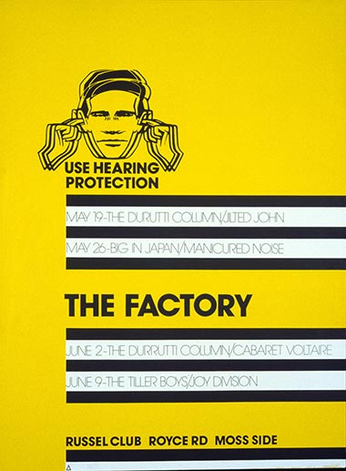
The Factory launch poster, 1978
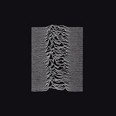
Joy Division, Unknown Pleasures, 1979
OMD, Achitecture and Morality, 1981